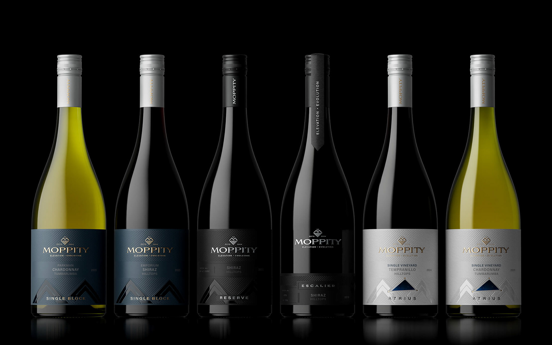
Moppity Wines
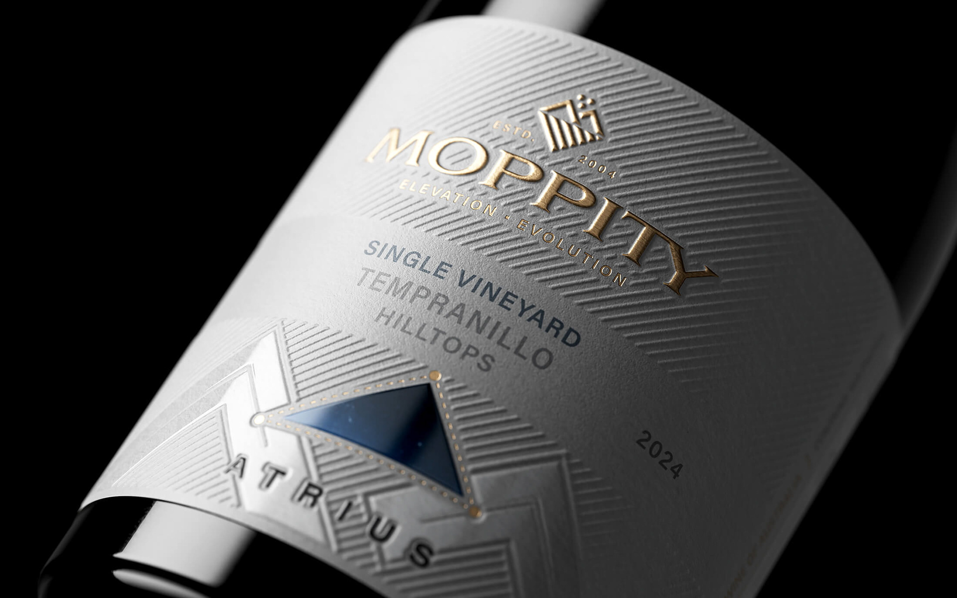
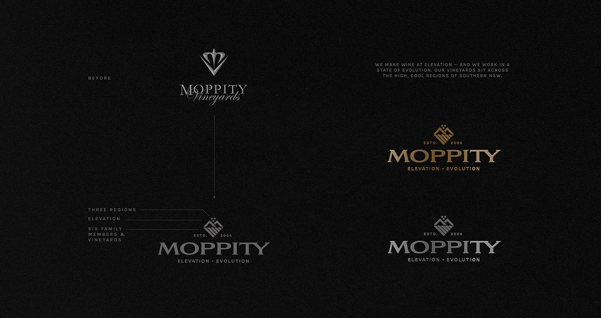
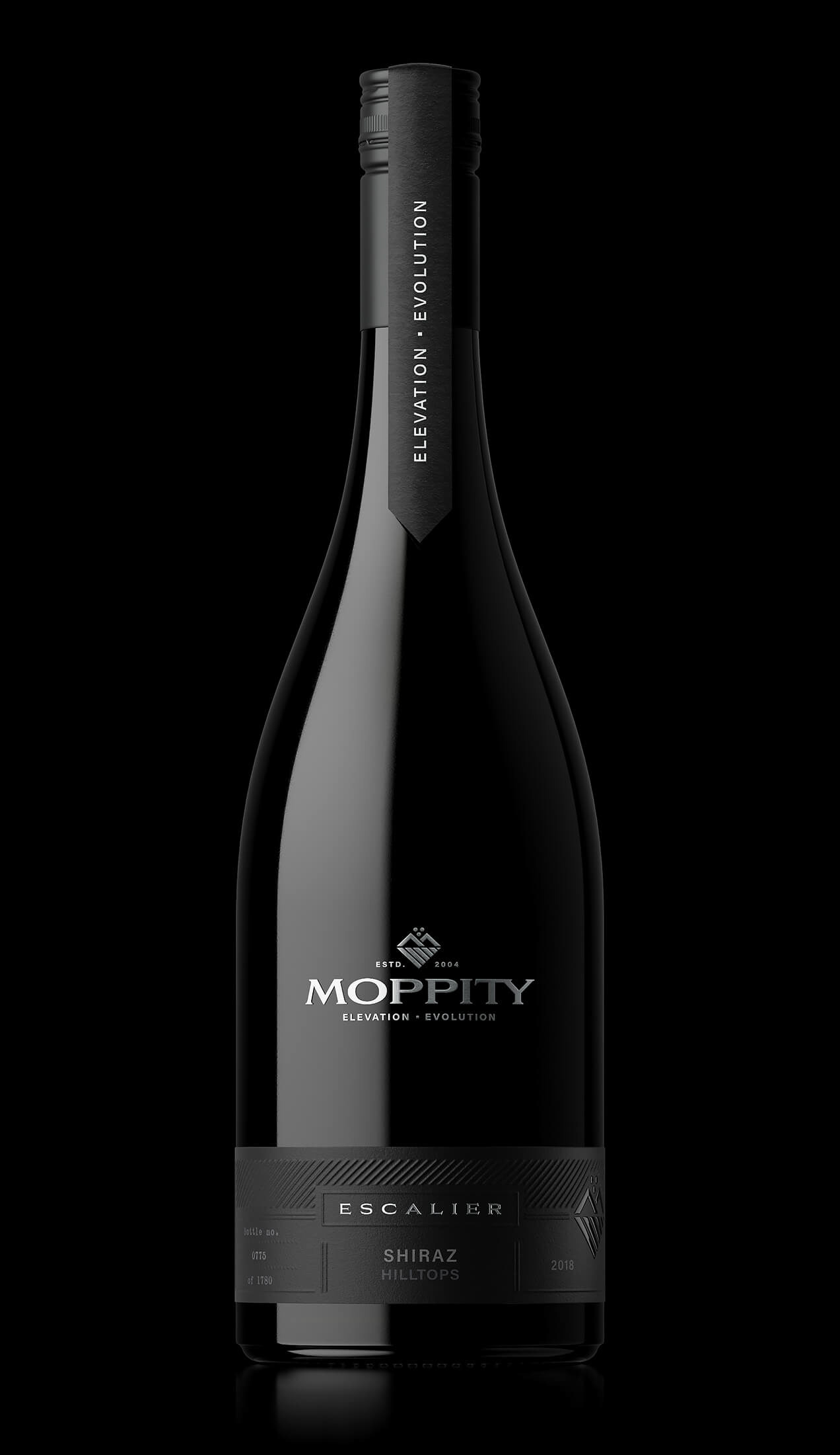
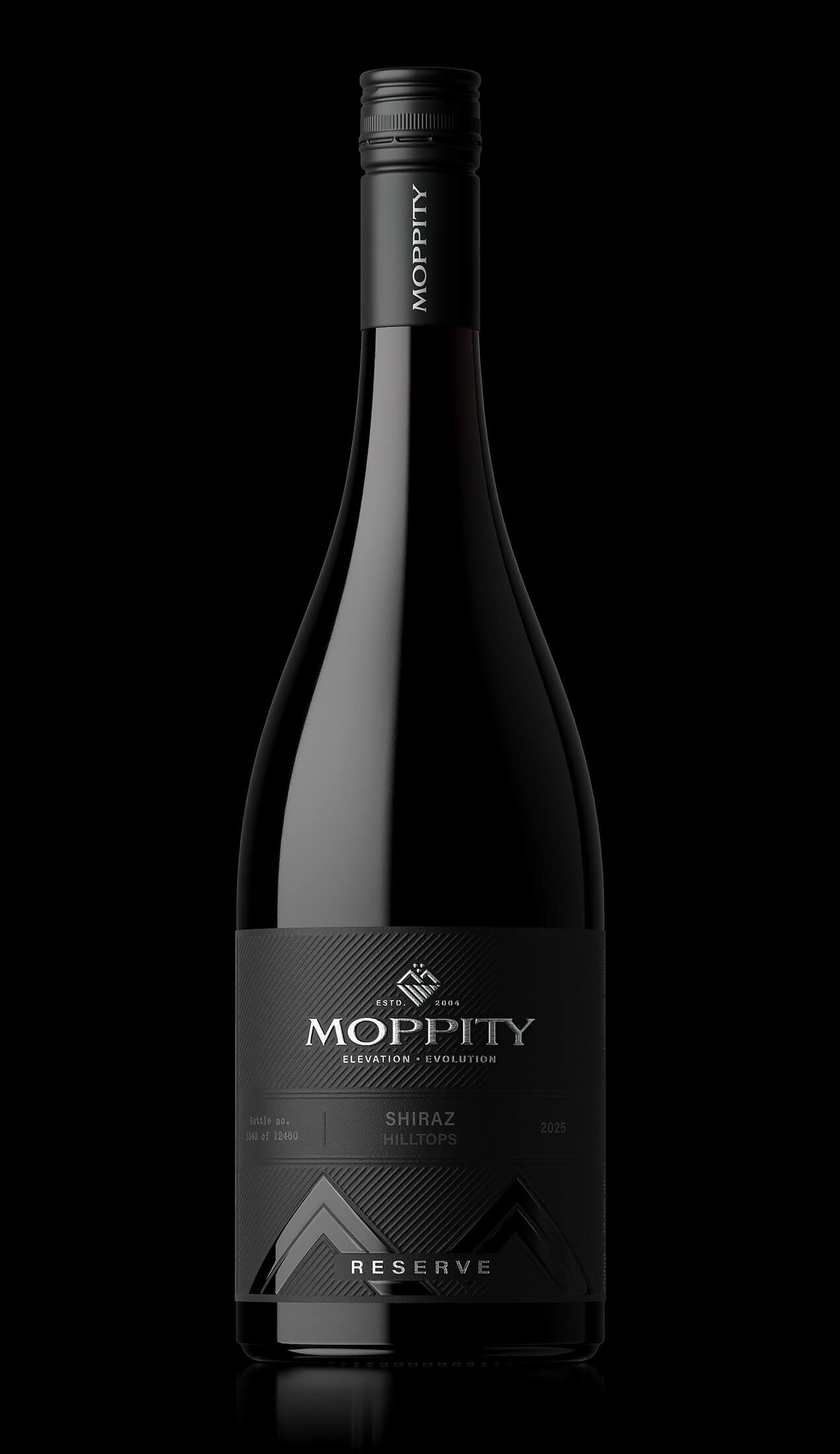
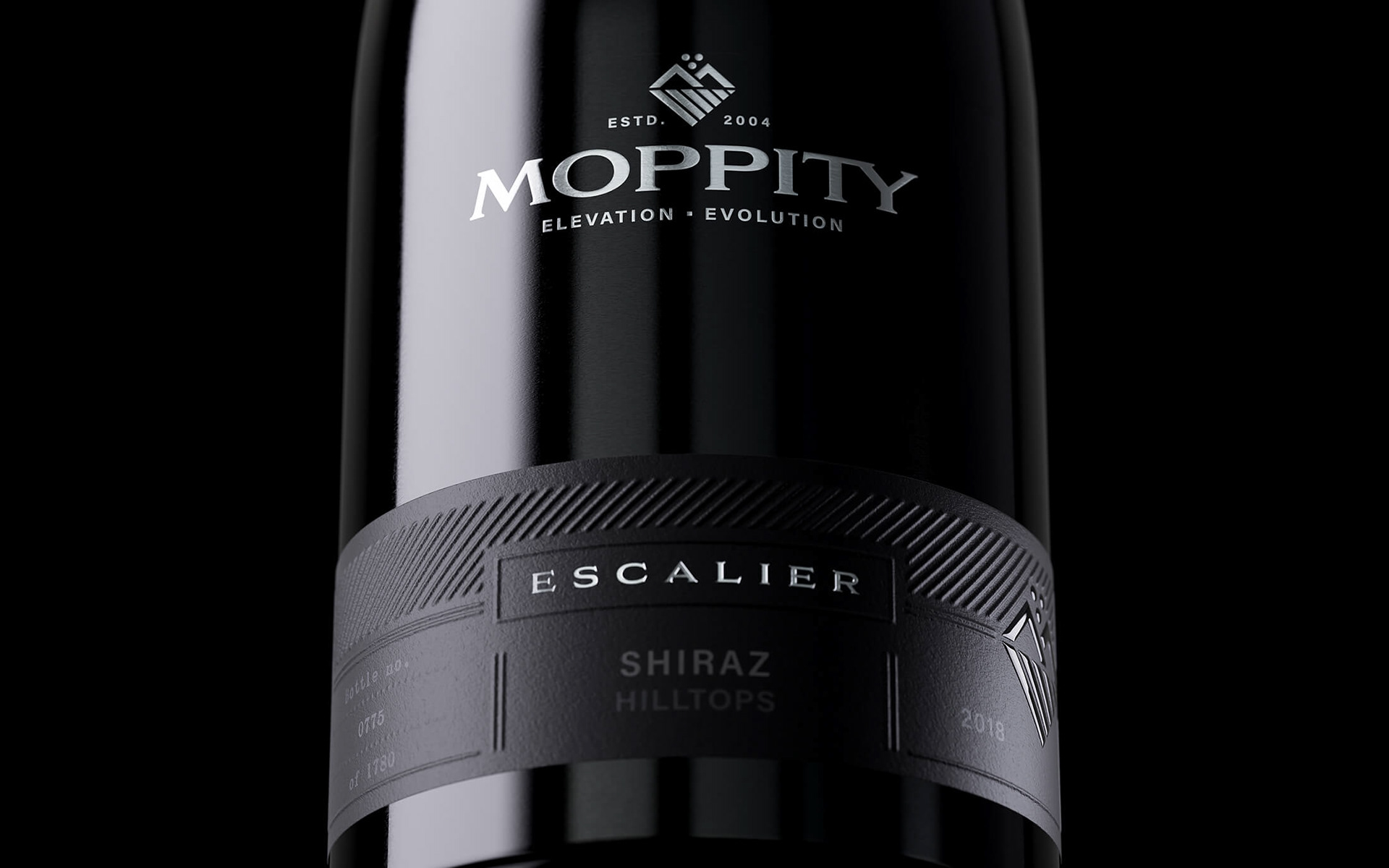
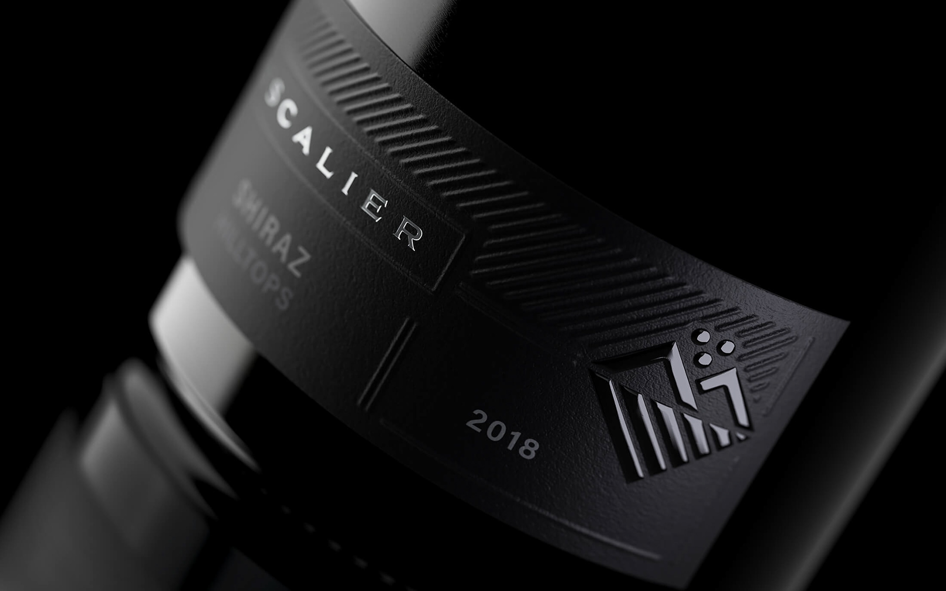
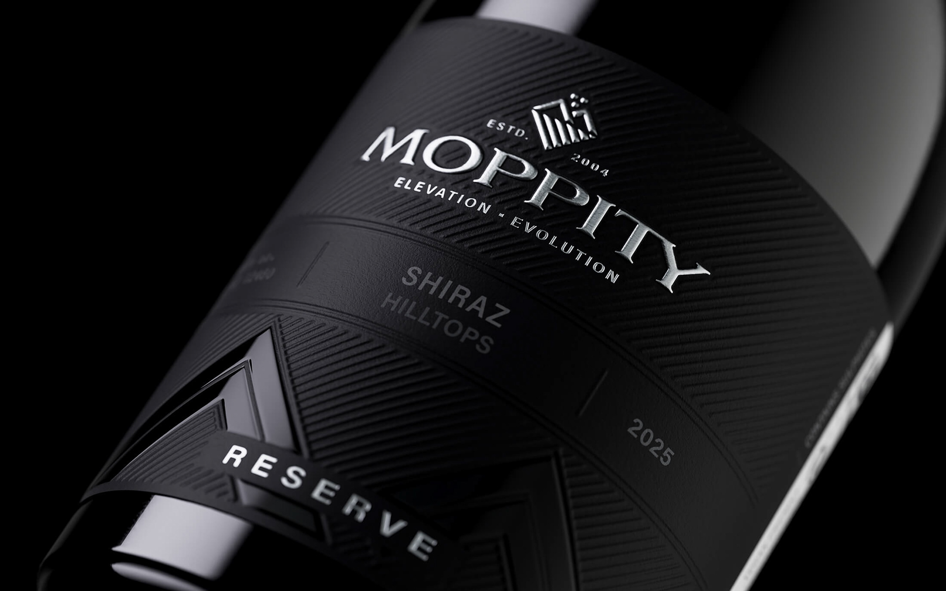
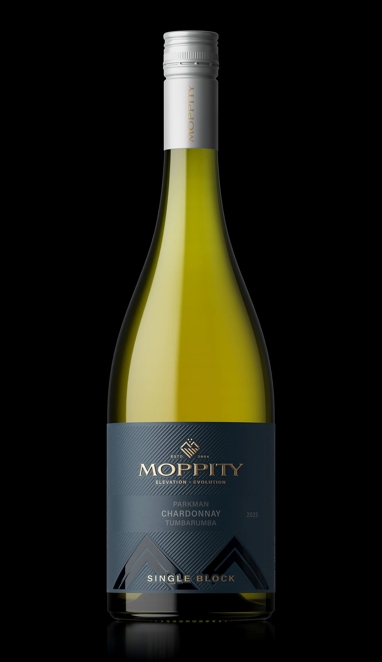
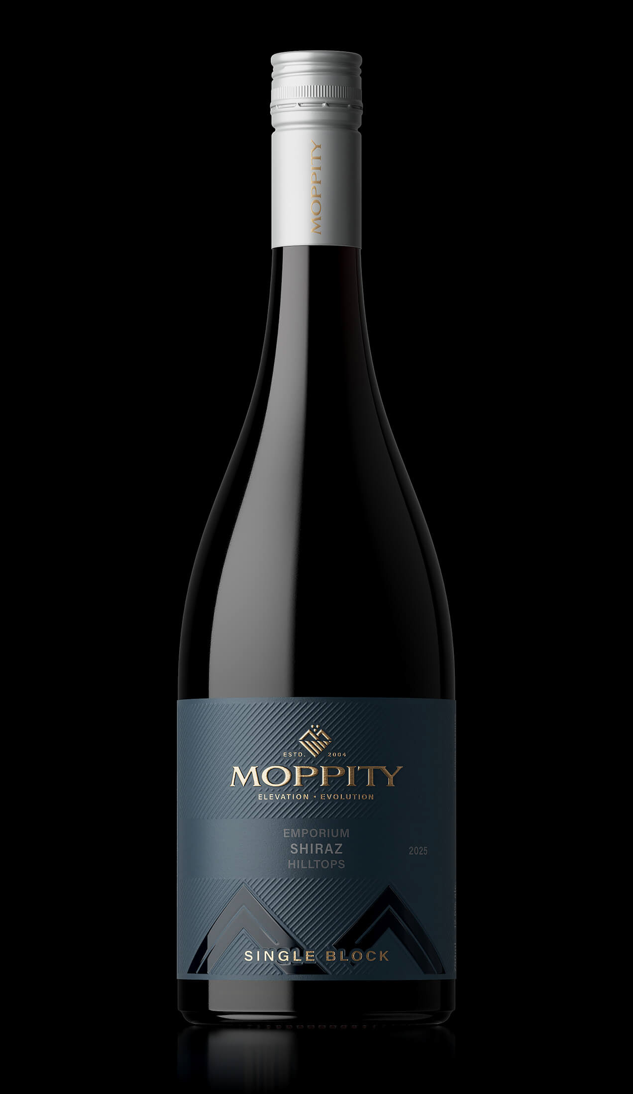
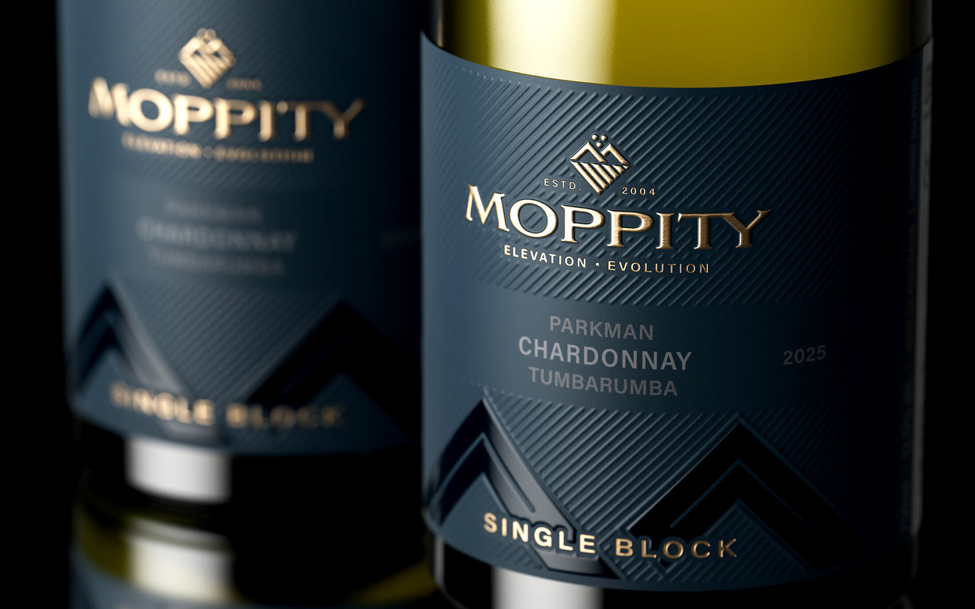
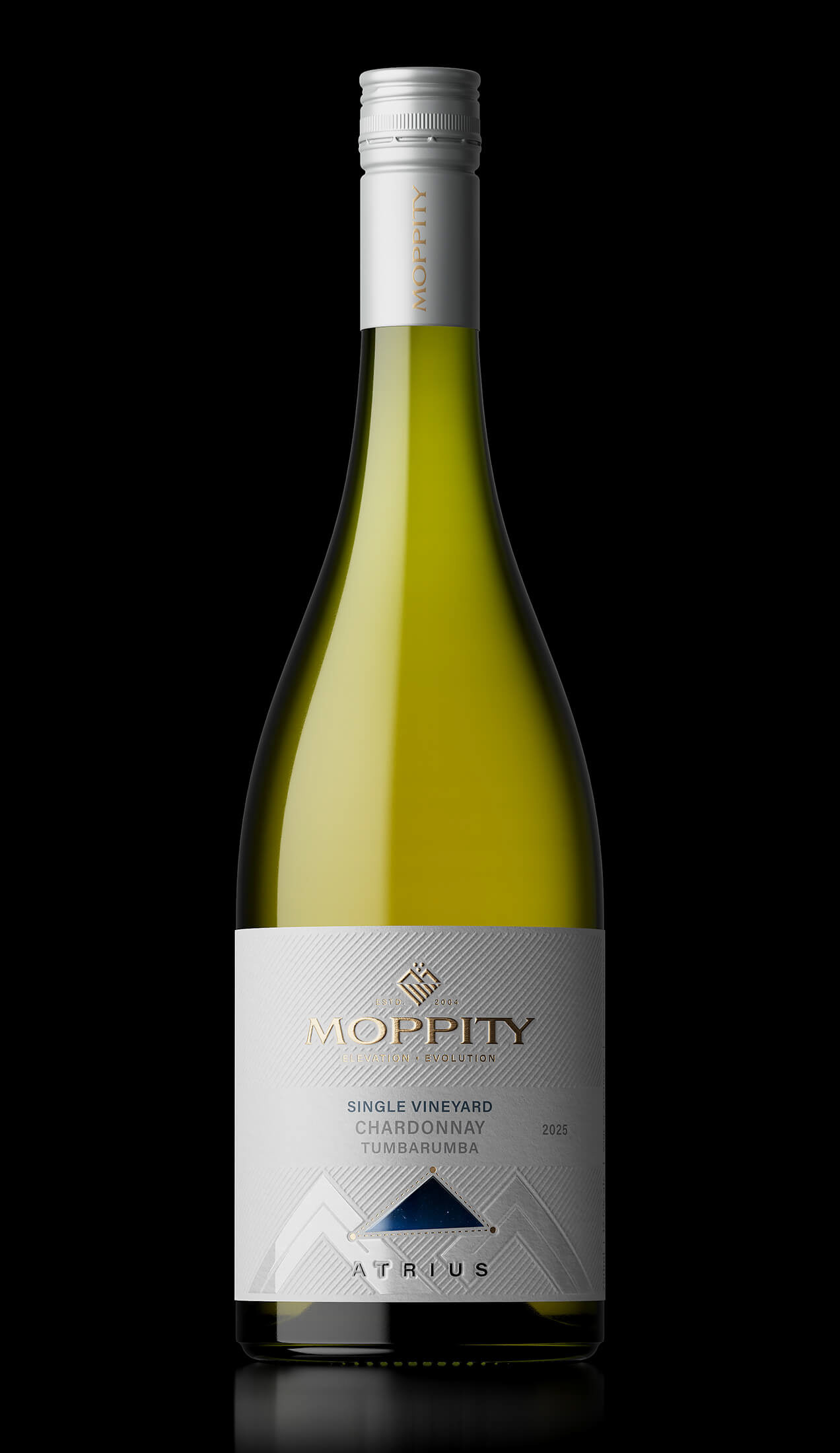
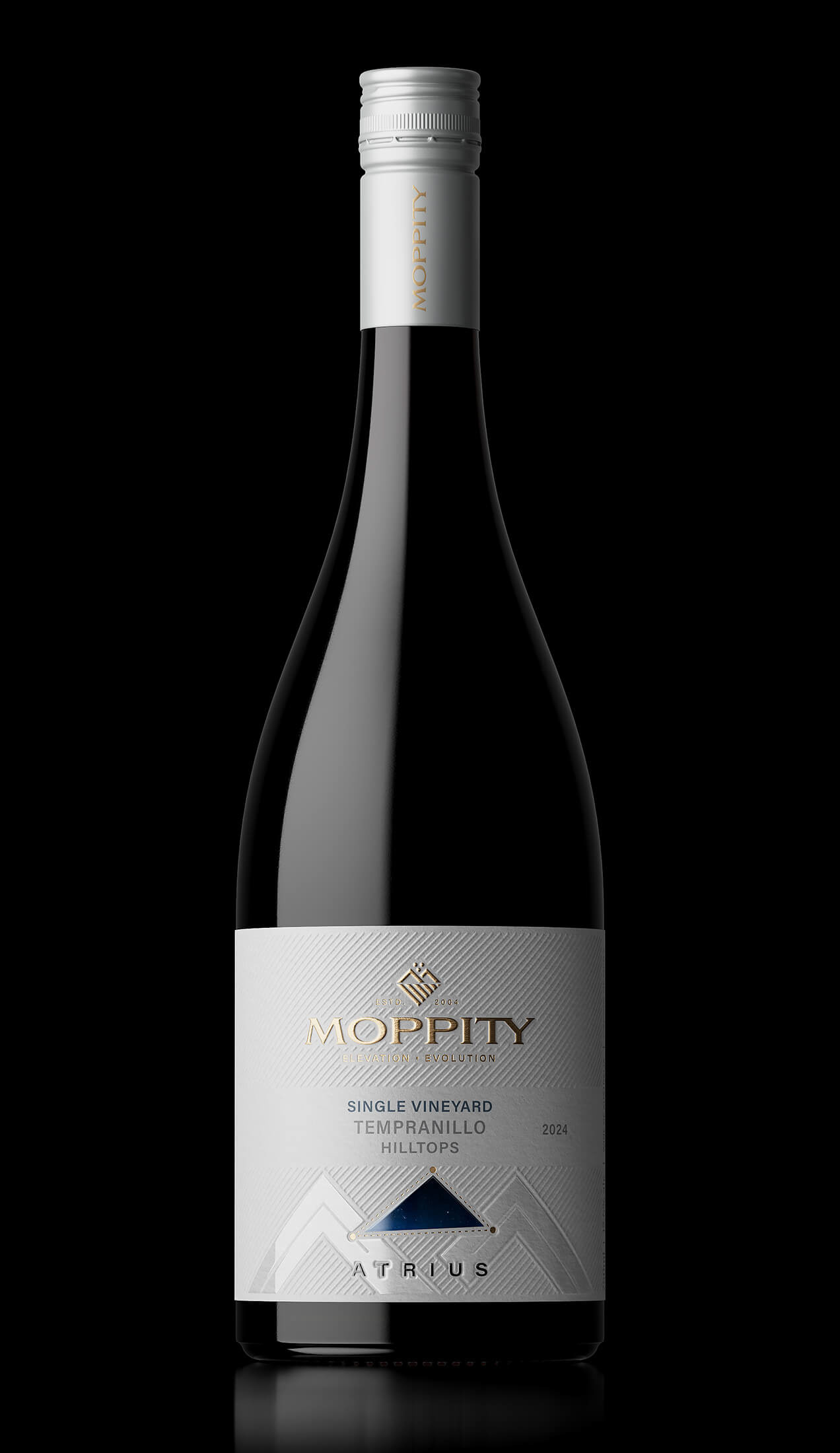
Logotype and labels design for Moppity Wines (Australia)
Brief:
We’ve had the same brand identity and packaging since 2004. It’s now tired, dated and lacks shelf presence. We see ourselves as a producer of exciting, contemporary wine styles. We need to look serious but modern.
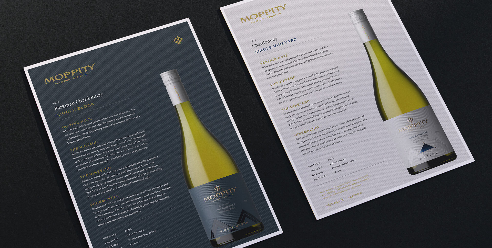
We make wine at elevation and we work in a state of evolution. Our vineyards sit across the high, cool regions of Southern NSW: places of long ripening, natural acidity, bright fruit and fine structure.
Design Style & Aesthetic:
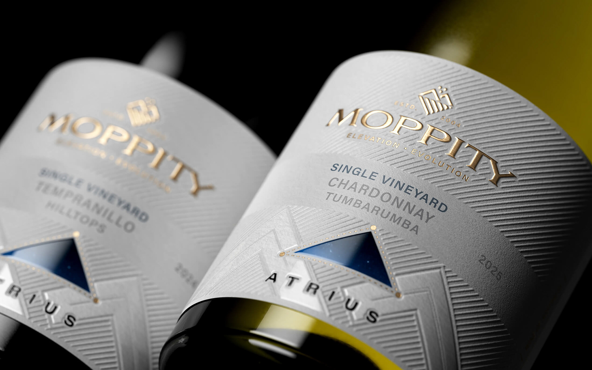
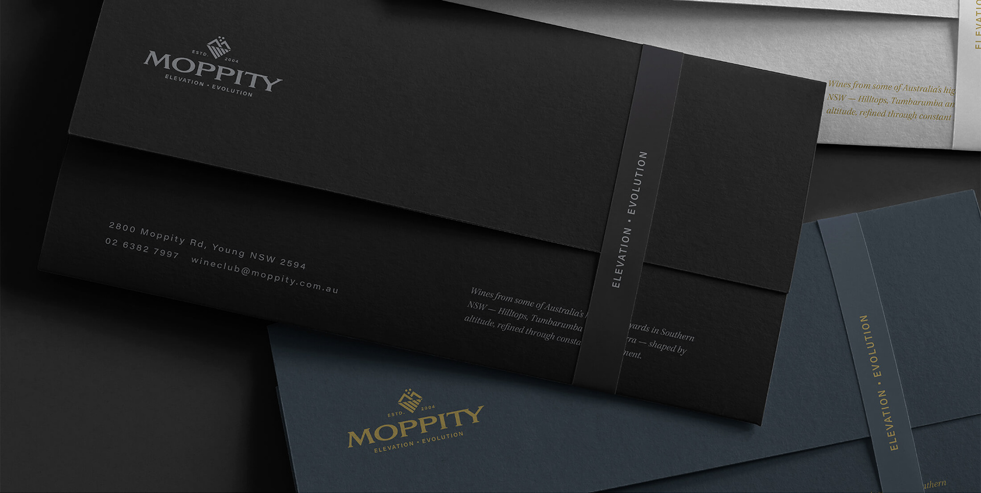
Premium feel with tactile elements (embossing, texture, foil detail etc.) Minimalist approach.
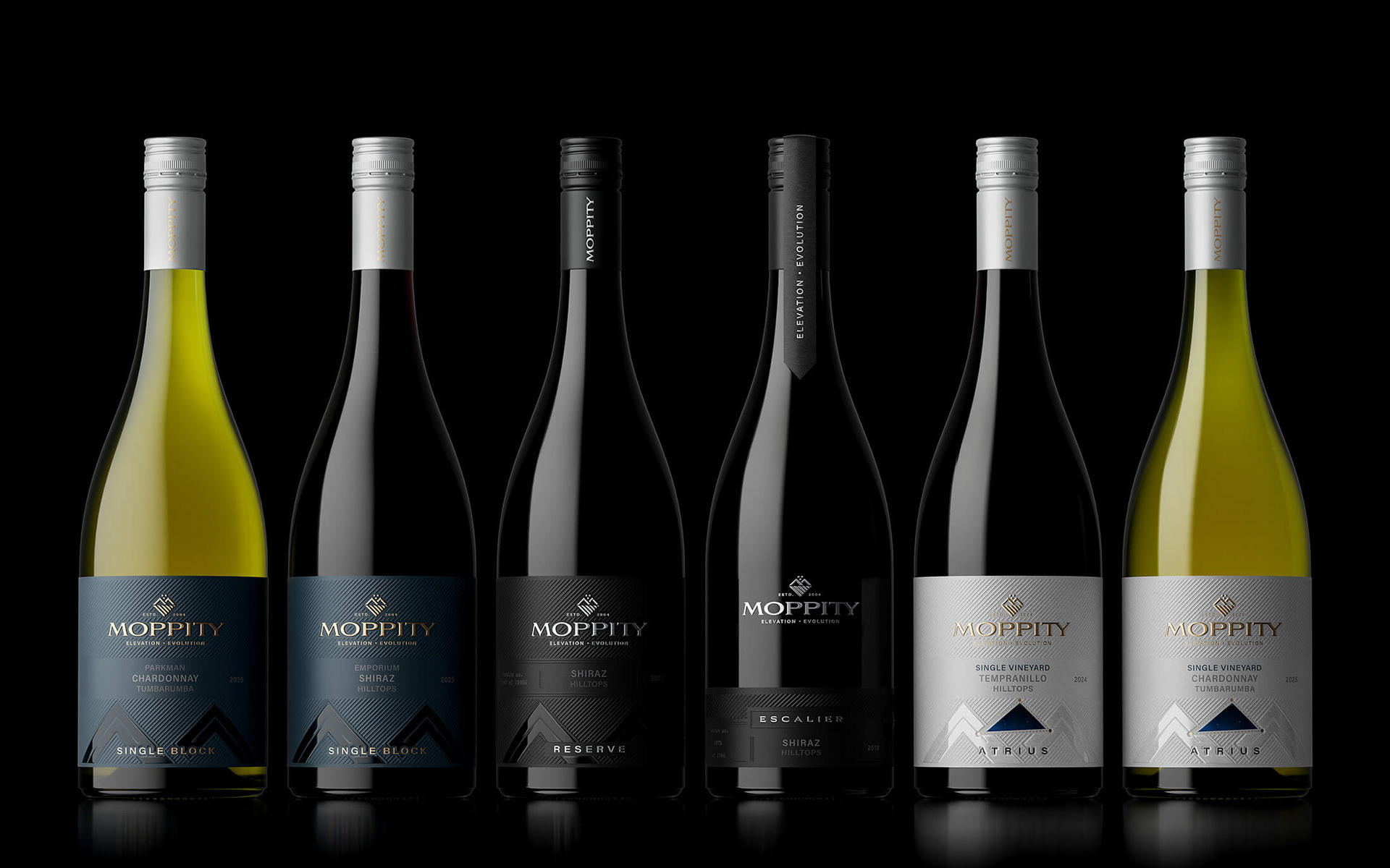
Clear identification and hierarchy between the different ranges.